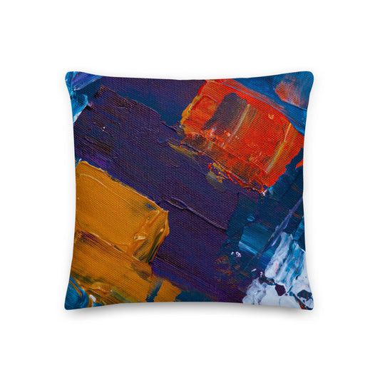
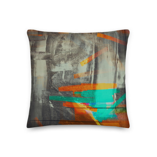
An abstract pillow is bought for its colors rather than its subject, which makes it the easiest print to add to a space with a patterned rug, a painting on the wall and a sofa with opinions of its own. Here that means weathered grunge designs in rust, orange, dark red and red with blue, and painted color fields in blue, orange and purple or gray and teal, all on a linen look case with a removable insert.
-
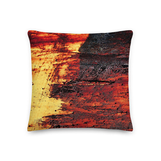
Clochard Grunge Dark Red Throw Pillow
Vendor:Good Doer by GianneliRegular price $75.95 USDRegular price -
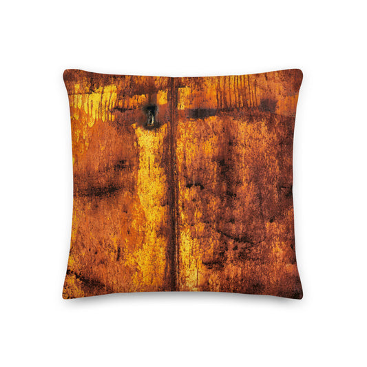
Clochard Grunge Orange Throw Pillow
Vendor:Good Doer by GianneliRegular price $75.95 USDRegular price -
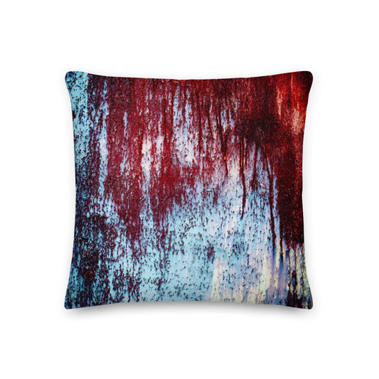
Clochard Grunge Red and Blue Throw Pillow
Vendor:Good Doer by GianneliRegular price $75.95 USDRegular price -
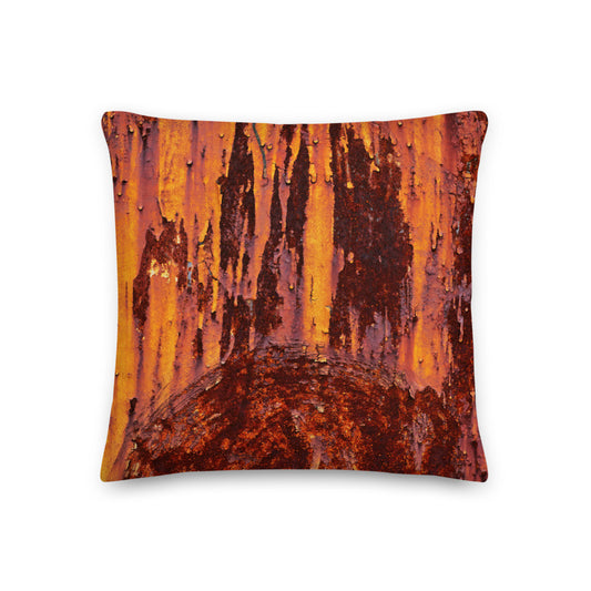
Clochard Grunge Rust Throw Pillow
Vendor:Good Doer by GianneliRegular price $75.95 USDRegular price -
Gianneli Colours Blue Throw Pillow
Vendor:Good Doer by GianneliRegular price $65.95 USDRegular price -
Gianneli Colours Gray and Teal Throw Pillow
Vendor:Good Doer by GianneliRegular price $65.95 USDRegular price






Guides for Home & Decor
View all-

Throw Pillow Sizes That Leave Room to Sit
A pillow should earn its place when someone sits down. Compare square and lumbar shapes, check what comes in the package, and find a scale that works with your furniture.
Throw Pillow Sizes That Leave Room to Sit
A pillow should earn its place when someone sits down. Compare square and lumbar shapes, check what comes in the package, and find a scale that works with your furniture.
-

How to Set a Table for a Dinner Party
Every guide shows you where the fork goes. Almost none tells you what to own, which is the part that decides whether hosting feels calm or frantic.
How to Set a Table for a Dinner Party
Every guide shows you where the fork goes. Almost none tells you what to own, which is the part that decides whether hosting feels calm or frantic.
-

How to Refresh Your Living Space for the Season
Every room has a rhythm that drifts out of sync when the weather turns. Suddenly the space feels heavier or darker than it should, and the urge is to change...
How to Refresh Your Living Space for the Season
Every room has a rhythm that drifts out of sync when the weather turns. Suddenly the space feels heavier or darker than it should, and the urge is to change...
- More from the blog, not specific to this page.

How to Choose a Leather Desk Pad That Fits Your Desk
Measure the mouse sweep before the desk. Which size, why leather for a workday desk, what OSHA says about wrist rests, and a size chart that fits on a phone.
How to Choose a Leather Desk Pad That Fits Your Desk
Measure the mouse sweep before the desk. Which size, why leather for a workday desk, what OSHA says about wrist rests, and a size chart that fits on a phone.


