A print on a sweatshirt lasts longer than the same print on a t-shirt, and the reason has nothing to do with how it was applied. A sweatshirt is an outer layer. It touches fewer things, gets washed less often, and spends less time under a seatbelt or a bag strap.
-
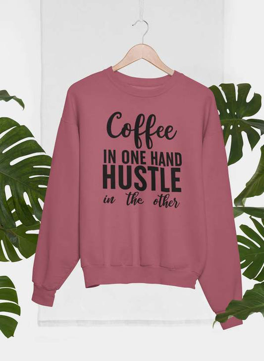
Coffee In One Hand Hustle In The Other Sweatshirt
Vendor:Bella + CanvasRegular price From $58.95 USDRegular price -
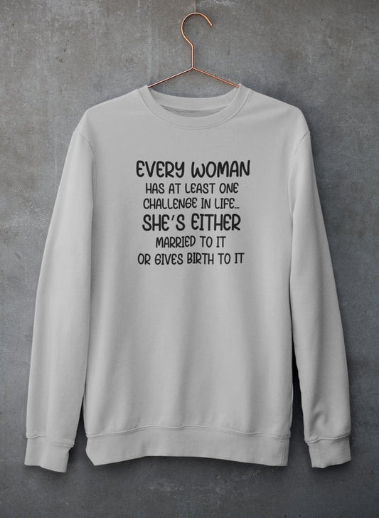
Every Woman Has At Least One Challenge In Life Sweatshirt
Vendor:Bella + CanvasRegular price From $58.95 USDRegular price -
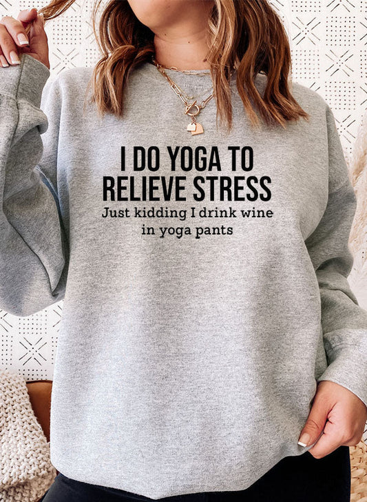
I Do Yoga To Relieve Stress Sweatshirt
Vendor:GildanRegular price From $58.95 USDRegular price -
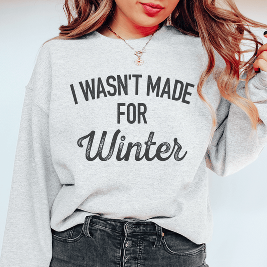
I Wasn't Made For Winter Sweatshirt
Vendor:GildanRegular price From $58.95 USDRegular price -
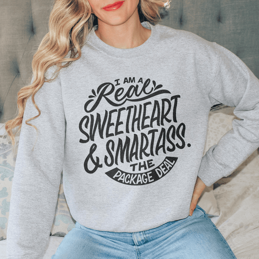
I'm A Real Sweetheart Fleece Sweatshirt
Vendor:GildanRegular price From $58.95 USDRegular price -
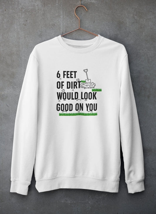
Six Feet Of Dirt Would Look Good On You Sweatshirt
Vendor:Bella + CanvasRegular price From $58.95 USDRegular price -
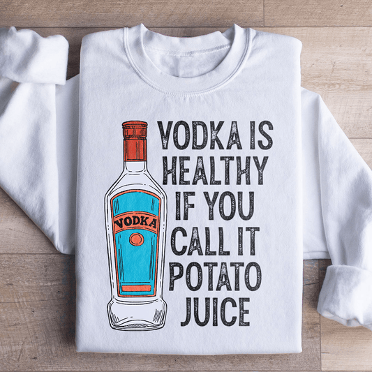
Vodka Is Healthy If You Call It Potato Juice Sweatshirt
Vendor:GildanRegular price From $58.95 USDRegular price -
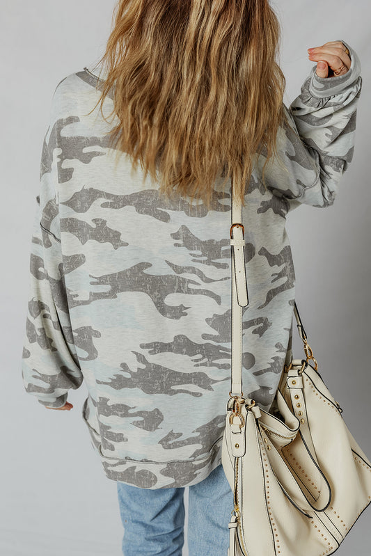
Women's Camo Oversized Sweatshirt with Exposed Seams
Vendor:Threaded PearRegular price $44.95 USDRegular price -
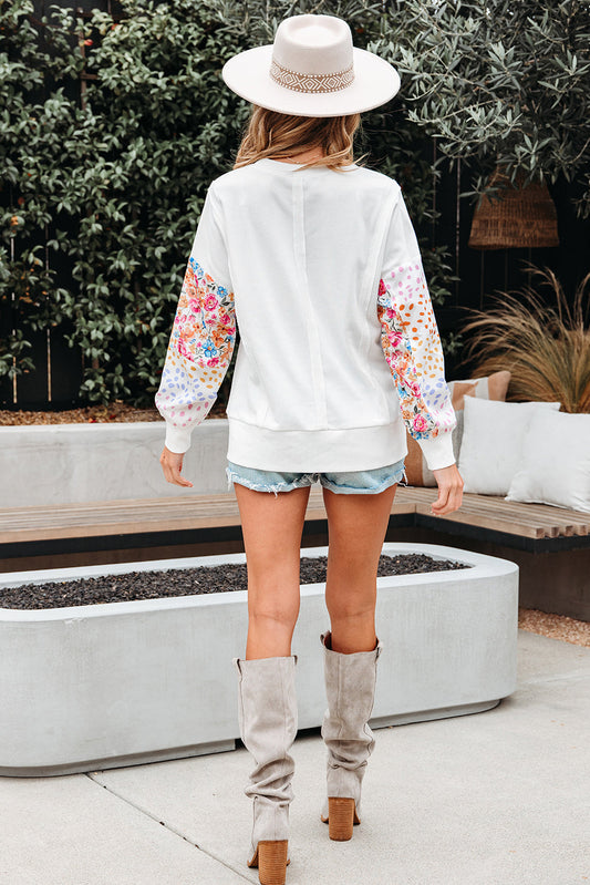
Women's Floral Sleeve Sweatshirt with Side Slits in White
Vendor:Threaded PearRegular price $49.95 USDRegular price -
Women's Leopard Sweatshirt with Striped Balloon Sleeves
Vendor:Threaded PearRegular price $50.95 USDRegular price











Guides for Apparel
View all-

How to Build a Capsule Wardrobe That Works
A packed closet and nothing to wear is a coherence problem, not a shortage one. A capsule wardrobe fixes it with a smaller set of pieces that all work together,...
How to Build a Capsule Wardrobe That Works
A packed closet and nothing to wear is a coherence problem, not a shortage one. A capsule wardrobe fixes it with a smaller set of pieces that all work together,...
-

Guide to Everyday Clothing That Balances Style, Comfort, and Longevity
Modern apparel is about versatility, comfort, and longevity. This guide explores how everyday clothing can support personal style, adapt to modern lifestyles, and deliver long term value without relying on...
Guide to Everyday Clothing That Balances Style, Comfort, and Longevity
Modern apparel is about versatility, comfort, and longevity. This guide explores how everyday clothing can support personal style, adapt to modern lifestyles, and deliver long term value without relying on...
-

How to Style Apparel Pieces for Different Occasions
Styling apparel is about adaptability, not excess. Learn how to transform everyday clothing into outfits suitable for different occasions while maintaining comfort, balance, and personal style.
How to Style Apparel Pieces for Different Occasions
Styling apparel is about adaptability, not excess. Learn how to transform everyday clothing into outfits suitable for different occasions while maintaining comfort, balance, and personal style.
-

Everyday Apparel Essentials
Everyday apparel essentials form the foundation of a functional wardrobe. Discover which clothing pieces deliver comfort, style, and versatility while supporting modern daily lifestyles.
Everyday Apparel Essentials
Everyday apparel essentials form the foundation of a functional wardrobe. Discover which clothing pieces deliver comfort, style, and versatility while supporting modern daily lifestyles.


