Most of the gray on this page is textile rather than painted surface: fabric drawer fronts, microfiber, corduroy and tufted upholstery. Gray behaves differently on cloth than it does on a panel, and almost everything worth knowing before you buy follows from that.
-
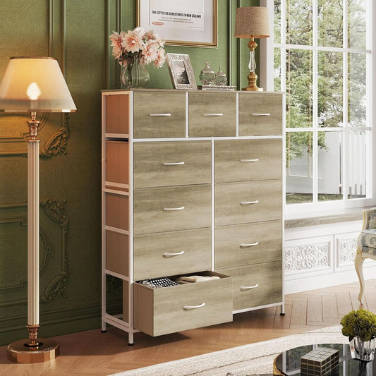
11 Drawer Greige Fabric Dresser Storage Tower
Vendor:ShipItFurnitureRegular price $176.95 USDRegular price -
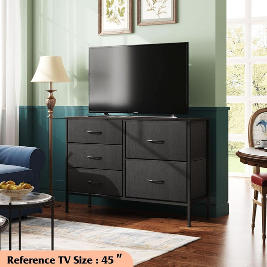
Charcoal Black Fabric Dresser with 5 Drawers
Vendor:ShipItFurnitureRegular price $124.95 USDRegular price -
Compact Foldable Desk in Gray and Gold Finish
Vendor:ShipItFurnitureRegular price $438.95 USDRegular price -
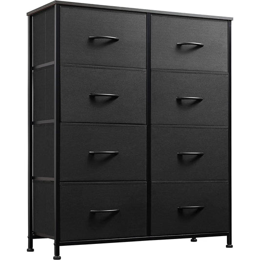
Fabric Storage Tower with 8 Drawers Charcoal Black
Vendor:ShipItFurnitureRegular price $135.95 USDRegular price -
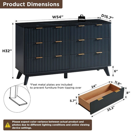
Fluted Dresser Dark Gray Faux Marble Top
Vendor:ShipItFurnitureRegular price $425.95 USDRegular price -
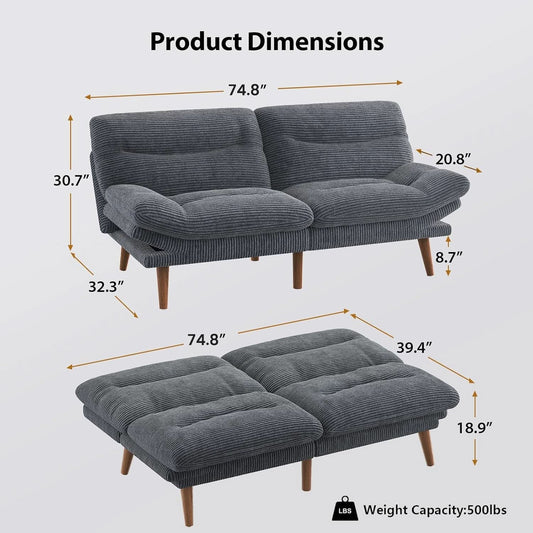
Gray Corduroy Sofa Bed with Adjustable Backrest
Vendor:ShipItFurnitureRegular price $425.95 USDRegular price -
Gray Microfiber Storage Ottoman with Removable Tray
Vendor:ShipItFurnitureRegular price $148.95 USDRegular price -
Industrial Charcoal Gray Bar Stools Set of Two
Vendor:ShipItFurnitureRegular price $273.95 USDRegular price -
Mobile File Cabinet with Two Fabric Drawers Light Gray
Vendor:ShipItFurnitureRegular price $251.95 USDRegular price -
Tufted King Headboard in Gray with Adjustable Wall Mount
Vendor:ShipItFurnitureRegular price $291.95 USDRegular price










Blog posts
View all-

Dog Harness vs Collar: What Vets and Trainers R...
Every guide says the same thing: harnesses spread pressure, so buy one. Two of the four questions people actually ask are about why trainers disagree.
Dog Harness vs Collar: What Vets and Trainers R...
Every guide says the same thing: harnesses spread pressure, so buy one. Two of the four questions people actually ask are about why trainers disagree.
-

Sensory Bin Ideas for Toddlers: What Goes In th...
Every guide solves the filler. Rice, pasta, cloud dough. What almost none of them covers is the part that decides whether a bin holds a toddler: what you bury in...
Sensory Bin Ideas for Toddlers: What Goes In th...
Every guide solves the filler. Rice, pasta, cloud dough. What almost none of them covers is the part that decides whether a bin holds a toddler: what you bury in...
-

How to Set a Table for a Dinner Party
Every guide shows you where the fork goes. Almost none tells you what to own, which is the part that decides whether hosting feels calm or frantic.
How to Set a Table for a Dinner Party
Every guide shows you where the fork goes. Almost none tells you what to own, which is the part that decides whether hosting feels calm or frantic.
-

How to Keep Kids Active and Off Screens This Su...
The school year ends, the days lose their shape, and devices quietly fill the gap. Very few parents choose this; it simply happens because reaching for a screen is easier...
How to Keep Kids Active and Off Screens This Su...
The school year ends, the days lose their shape, and devices quietly fill the gap. Very few parents choose this; it simply happens because reaching for a screen is easier...


